 Have you ever looked at a picture of a really old document or an inscription on the wall of an old building and thought, “Why are there F’s instead of S’s? Did F stand for S back then?” But no, it’s only some of the S’s that look like F’s, not all of them: You’ll see both letters right next to each other, so it’s not like they didn’t have the letter S back then. Confusing, right?
The answer lies in the fact that that’s not an F at all. It’s actually a letter called the medial S, also known as the long S, which was a second form of the lowercase letter S. This old-fashioned letter has a long history. It’s derived from the Roman cursive S, and it survived as the Old English S, then onward through the history of English orthography until the 1800s.
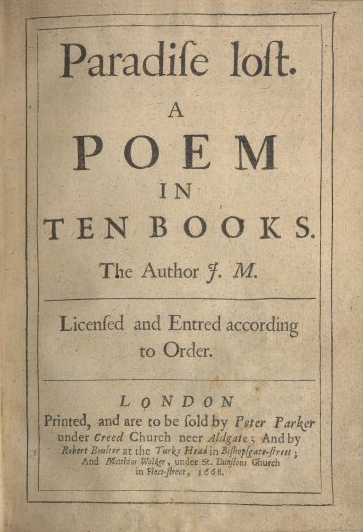
The history of S is a twisting, turning path. Until around the 1100s or so, the medial S was the lowercase form of the letter, while the curvy line we use today was the uppercase form. But over time, the regular S, technically known as the “round S” or “short S,” started being used as a lowercase letter, too. By the 1400s, a new set of S usage rules was established: The medial S would be used at the beginning of a lowercase word or in the middle of a word, while the round S would appear either at the end of a word or after a medial S within a word, as in “Congreſs” (which appears in the first line of Article I of the Constitution).
 Why did the old S go away? The answer lies largely in the use of the printing press. After all, why should printers keep two different forms of the lowercase letter S around when they could just use one and the words would still be readable? And if you have to choose one symbol for S, it only makes sense to choose the one that isn’t easy to mistake for an F.
Today, few people use this old-fashioned letter, but the Old English S did survive as a piece of mathematical notation. In calculus, the integral symbol ∫ is derived from the first letter of the word “summa,” Latin for “sum,” back when it would have started with a medial S. You’ll also see the early S behind the bar of many drinking establishments: It’s in the logo on every bottle of Jägermeister (or should that be “Jägermeiſter”?).
Just to point out that the flong-s, the s like an f, is different from an f only in that the right hand side of the centre cross bar is removed. The left hand side of the cross bar is intact. It is even more identical to an f that we/you realise.
If you read L. Digges poem from the First Folio of Shakespeare’s plays (but read the original online, your copy will be a modern typeface) you will see that Stratford moniment is easily read as Stratsord moniment. Straight-sword moniment. It’s an alternative form of Shake-speare. Straight = Shake and Sword = Speare. Solved it.
Interesting. Though it does look like the line in “Stratford” extends to the right, making it an F, not an S, at least in this image: http://internetshakespeare.uvic.ca/media/facsimile/lowres/Bran_F1/1998.04.0013l-800w.jpg
You are correct, but I wasn’t saying that it was not an f. I am saying all the non-italic (therefore highlighted) words in the piece are pushing us to read it as an s. Shake-fpeare and Nafo have a medial flong-s that is almost identical to the f in Stratford, also highlighted by being non-italic. Stratford, alone, is not referring to people.
The author is L. Digges. Dig and ges? it’s tempting to say Look dig and ges.
Nafo is Naso aka Ovid. His great work was Metamorphosis. A pointer.
Juliet. What’s in a name. A pointer.
Romeo. Wherefore art thou Romeo. he’s hiding. A pointer.
Romans. Romulus and Remus, twins, Romulus killed Remus, Stratsord is a twin of Shakespeare and he is killing off his pen name.
That’s what I think.