Impress your nerdiest friends by learning some fun words about typography!
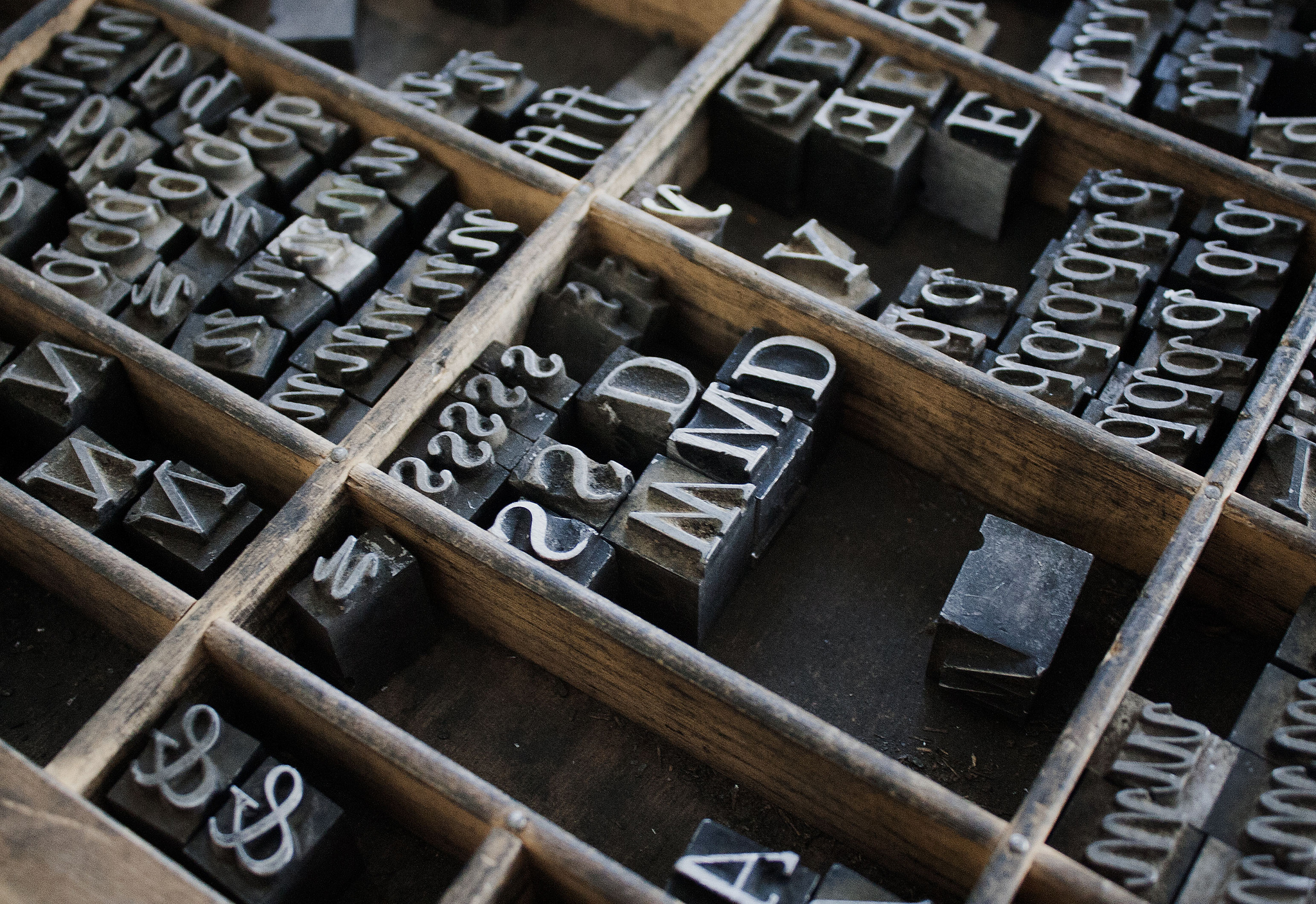
Photo by Will Keightley (Flickr)
If you’re the type of person who frequents freelance writing sites, you’re probably also a logophile, someone who loves words — a word nerd, if you will. But while some people geek out about words, others find themselves fascinated by parts of words, about the individual characters and parts of characters that make up what we write. Many interesting terms exist to describe what we see on a page of text, from parts of individual letters to the spacing between them. Here, then, is a list of typographical terms that word-lovers are sure to devour. (If nothing else, learning these words might help you win at Scrabble.)
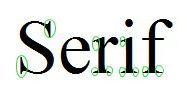 Serif
Serif
Serifs are the little “feet” on certain letters in a serif typeface, little ornamental bits on the edges of letters that help them flow together a bit better when you’re reading a block of text. The most common serif typeface is probably Times New Roman; other popular choices include Baskerville, Garamond, and Palatino.
 Tittle
A tittle is the dot on top of a lowercase I. (Bet you didn’t know that had a name, did you?)
Diacritical Marks
These little additions to letters are better known as accent marks. We don’t really use them much in English, except in a few words that we’ve borrowed from other languages. They can make a big difference in pronunciation: Just look at resume versus résumé. Here are a few of the most common diacritical marks:
- Acute accent: A line over the letter that slants upward from left to right: é
- Grave accent: A line over the letter that slants downward from left to right: è
- Cedilla: A little curly mark at the bottom of the letter that looks like a backwards C dangling from a stick: ç
- Circumflex: Sometimes referred to as a “hat,” it’s a little pointy caret-type mark over a letter: â
- Umlaut: Two dots over the top of a letter: ü
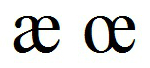 Ligature
In medieval Latin, some words contained characters that look like two letters pushed together. The most common of these characters, called ligatures, were æ and œ. While these characters still exist in some languages and retain distinct pronunciations, in English, they’ve been phased out, replaced by either ae or oe or just e. However, one ligature has persisted in some uses, though it has now evolved into something else…
Logogram
A logogram is a character that represents a whole word. One of the most common ones, found in signs and slogans, is this one: &. The ampersand actually started as a ligature of e and t, standing for the Latin word et, or and. Today, it’s a logogram pronounced as and. Other logograms in English include $ (dollars), = (equals), and % (percent) as well as all numerals.

Courtesy of xkcd.com
Kerning
Kerning refers to adjusting the horizontal spacing between individual letters and words, usually in a headline or on a sign. This isn’t something one has to adjust too often, but every once in a while, depending on the typeface and the combination of letters, a graphic designer might find places where the spacing looks uneven and a little kerning might make for a more pleasing look.
Leading
This word, pronounced “led-ing,” is another name for line spacing. Leading, like kerning, is more of a concern for graphic designers and others who work with setting type for print publication, since they might need to work more closely with aligning and spacing out their text to maximize readability. For freelance writers and others who typically write in a word-processing program, details like leading and kerning are typically handled for you by the software you use.